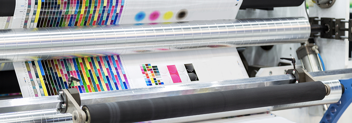
Colour Guide for Supplying Artwork for Print
When preparing artwork for print, understanding and managing color correctly is crucial to ensure that your final product matches your design intentions. This guide will help you navigate the key aspects of color management for print production.
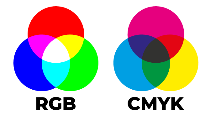
Understanding Color Modes
CMYK vs. RGB:
- CMYK (Cyan, Magenta, Yellow, Key/Black): This is the color mode used by printers. It works by combining these four inks in varying amounts to produce a wide range of colors. Always convert your artwork to CMYK before sending it to print to ensure color accuracy.
- RGB (Red, Green, Blue): This color mode is used for digital displays. RGB has a broader color gamut than CMYK, meaning some colors visible on your screen might not print accurately. Therefore, avoid using RGB for print files.
Converting to CMYK
When working in design software, ensure your document is set to CMYK mode:
- Adobe InDesign: Choose CMYK when creating a new document or convert an existing one via Edit > Convert to Profile.
- Adobe Illustrator: Set the color mode to CMYK via File > Document Color Mode > CMYK Color.
- Adobe Photoshop: Convert your document to CMYK via Image > Mode > CMYK Color.
Color Profiles
ICC Profiles:
- Standard Profiles: Use industry-standard ICC profiles like ISO Coated v2 for coated paper or PSO Uncoated v3 for uncoated paper. These profiles help ensure color consistency across different devices and printers.
- Custom Profiles: Some print companies provide specific ICC profiles tailored to their equipment. Always check with your printer and use their recommended profile if available.
Managing Colors
Spot Colors vs. Process Colors:
- Process Colors: These are created using the CMYK process and are how we produce your print jobs.
- Spot Colors: Used for achieving specific hues not possible with CMYK alone, such as metallic or fluorescent colors. Spot colors are often defined using the Pantone Matching System (PMS). We do not utilise Spot Colours in our production environment.
Consistency:
- Ensure consistent color usage throughout your document. Define colors using specific CMYK values or Pantone swatches to maintain uniformity.
- Avoid using rich blacks for small text or fine lines to prevent blurring. Use 100% black (K) for these elements instead.
Proofing and Adjustments
Soft Proofing:
- Use your design software’s proofing tools to simulate how your colors will appear in print. In Adobe products, you can enable Proof Colors under the View menu and select the appropriate profile for your printer.
Hard Proofing:
- If available with your custom printing job with RightPak. You can request a physical proof from us to see how the colors will look on the actual print material. This step is vital for critical color matching and can help identify any issues before the full print run. This service is not always available and will slow your production down due to the production of the proof, export and sign-off from you once you've reviewed the printed proof.
Preparing for Print
Flatten Transparencies:
- Flatten all transparencies in your artwork to prevent unexpected results. In Adobe InDesign, use File > Export and select the High Quality Print preset, then adjust the settings to flatten transparencies.
Embed Color Profiles:
- When exporting your final PDF, ensure you embed the color profile. In Adobe Acrobat, select PDF/X-1a:2001 or another print-standard format that includes the profile.
Final Checks
- Calibration: Regularly calibrate your monitor to ensure color accuracy. Invest in a good-quality monitor calibrator.
- Proofing Communication: Upon viewing your proof, you will be given the option to 'Approve' or 'Reject' your artwork. You will need to add comments when rejecting your artwork so that we understand your reasoning. For example 'Font issues' where you haven't correctly created your fonts in curves (when in PDF or EPS) or a typo has been missed before submitting your artwork. Once approved, you will have locked in the artwork on our system for production. It can not be re-supplied or amended for the current production run once you have approved your artwork.
By following this color guide, you can significantly improve the accuracy and quality of your printed materials, ensuring that your final product closely matches your design vision. Proper color management is essential for professional, vibrant, and consistent print results.
Packaging Types
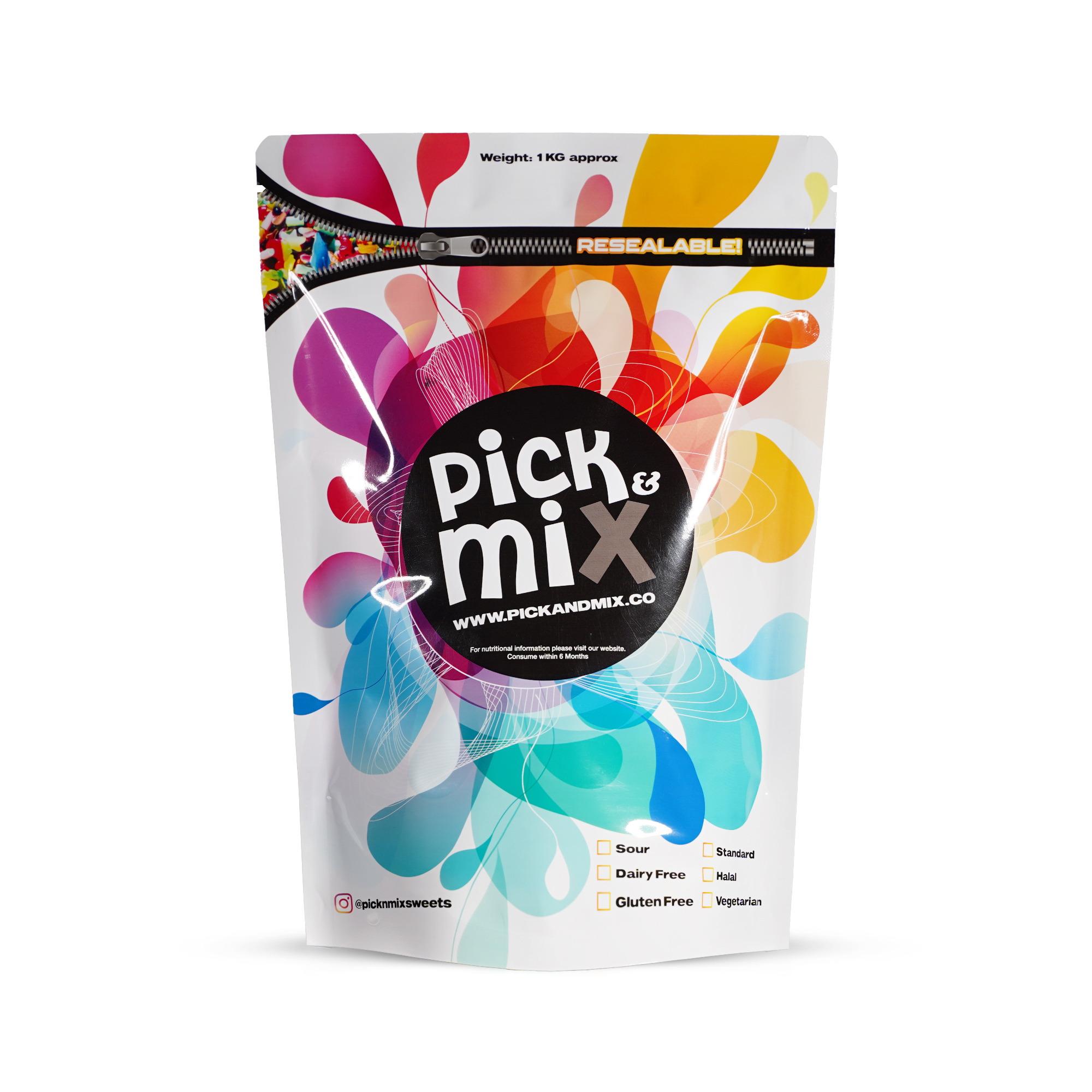
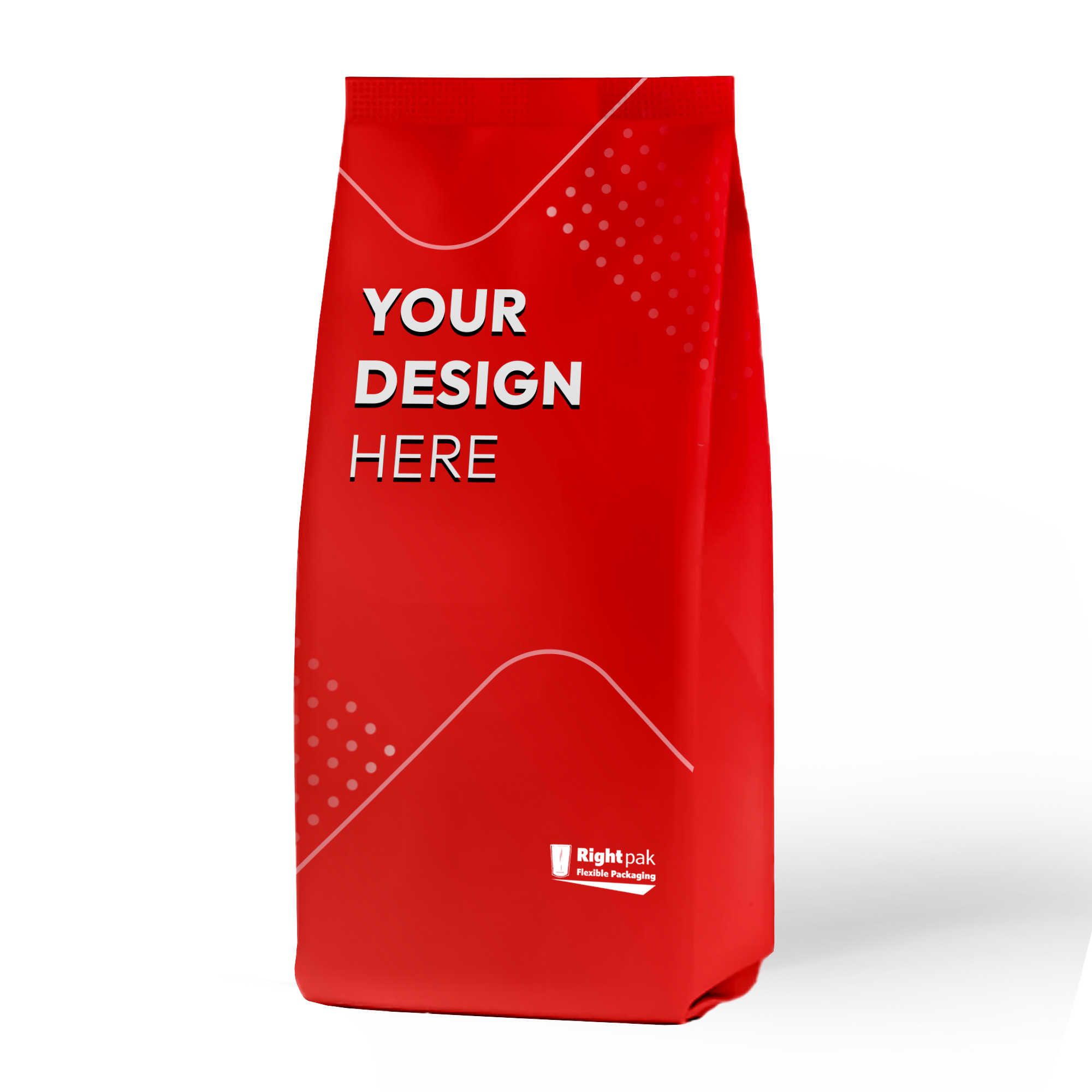
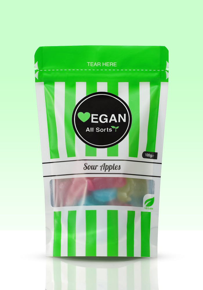
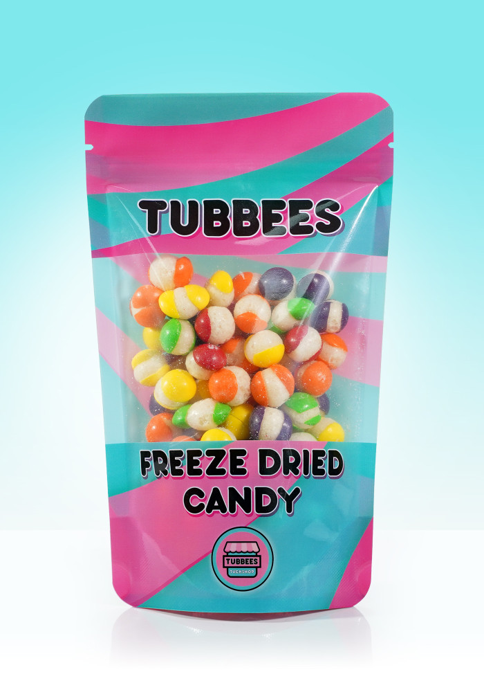
Stand Up Pouches
An ever popular packaging choice with an expanding bottom gusset that allows the pouch to go from space saving flat and compact, to self-standing as seen on many store shelves.
3 Side Seal
3 side seal pouches are a flat pouch that are made with 3 sides sealed, and one left open for you to apply your contents and heat seal close.
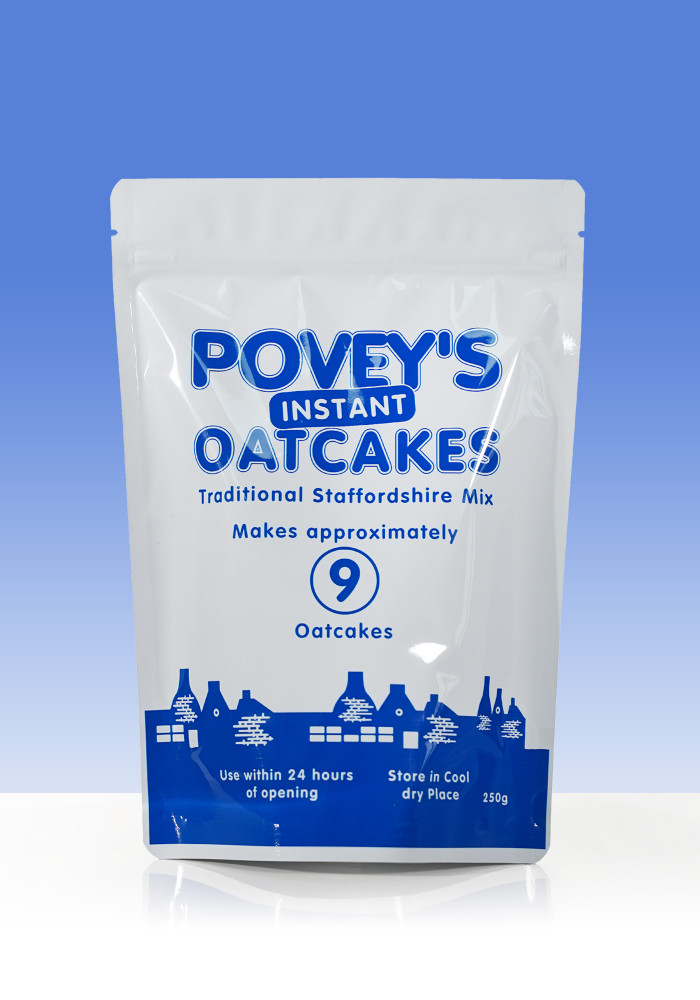
Side Gusset Pouches
Side Gusset pouches have two expanding side gussets without a resealable zip lock, offering a wide opening to provide unrestricted access to the contents within. The pouches have a single seal on one side of the pouch that runs from the top to the bottom of the pouch.
Flat Bottom Pouches
Also known as block bottom, box bottom pouches or 5 panel pouches; these have expanding side and bottom gussets that allows the pouch to go from space saving flat and compact, to self-standing thanks to its Flat Bottom feature.
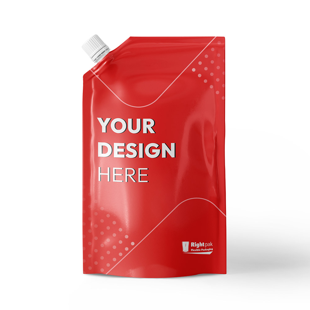
Spout Pouches
Spout Pouches are stand up bottom gusset pouches with a spout and resealable screw cap. These are an ideal durable packaging choice for products that need to be poured or easily squeezed to ensure that all contents are extracted avoiding waste.
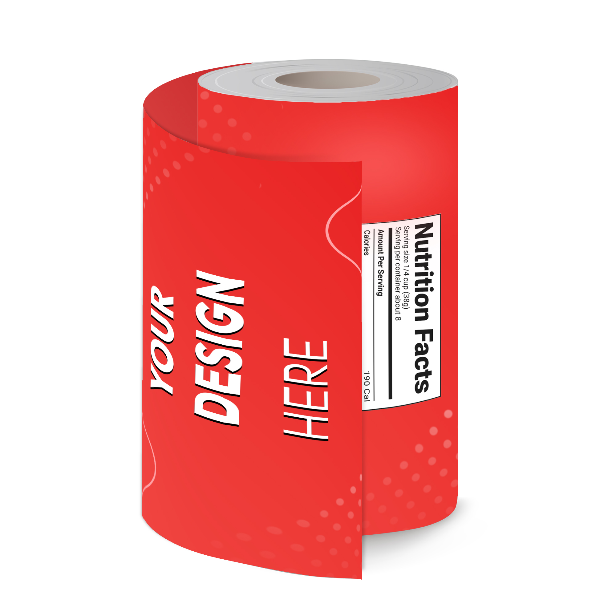
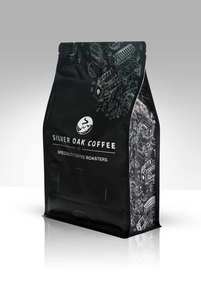
Printed Film
Printed Film also known as Printed Roll, Flow Wrap or Roll Stock is available in various films printed with your design and supplied on a roll to your specifications. This will be formed into your desired packaging type such as packets, sachets and lay flat pouches during the form fill and seal process using machines such as VFFS.
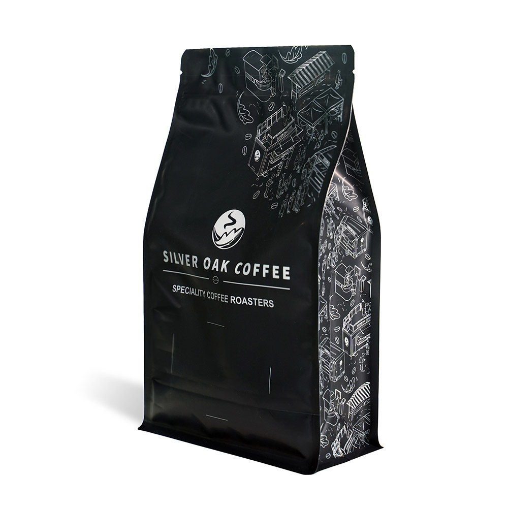
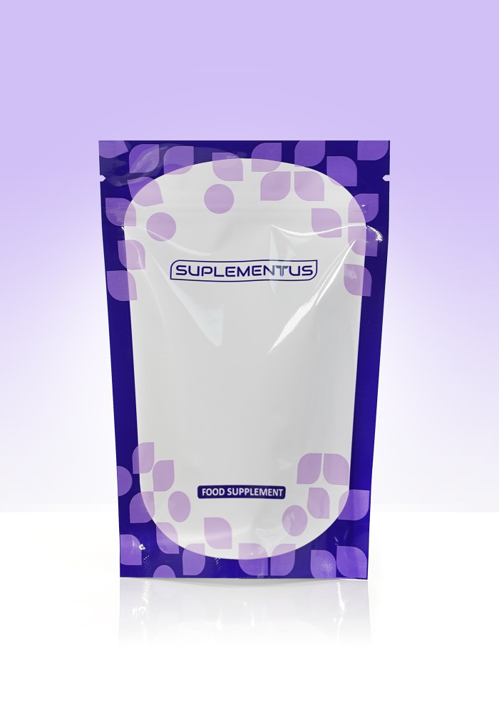
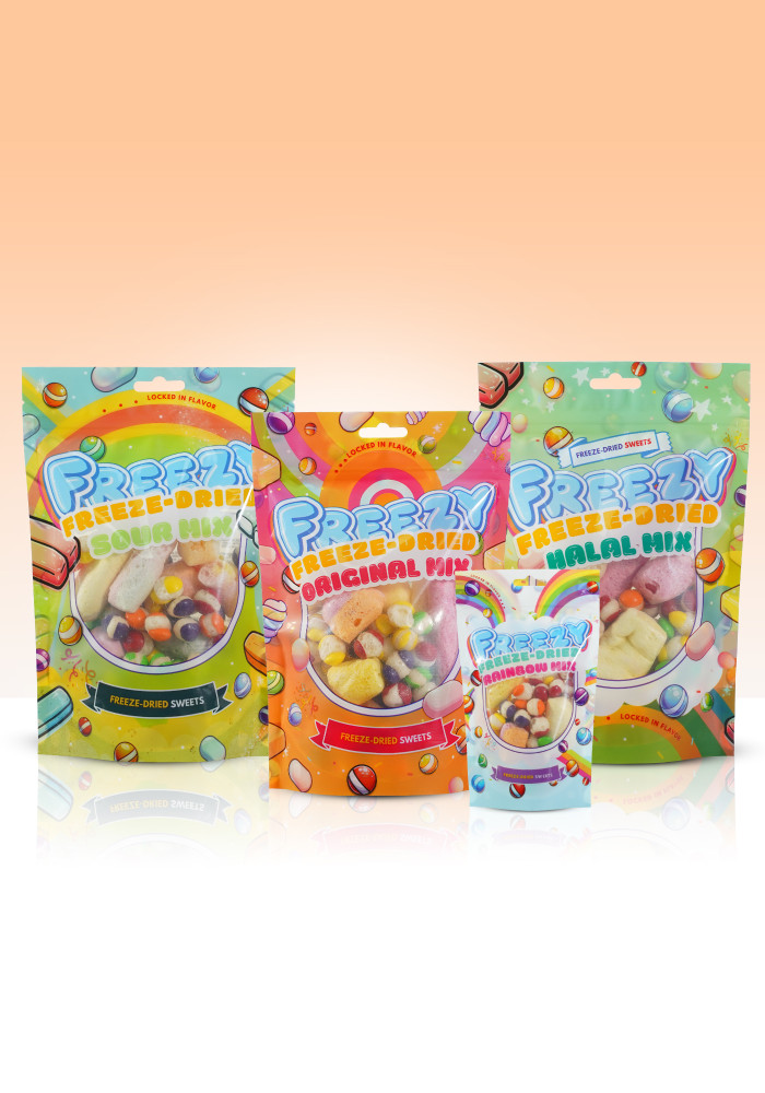
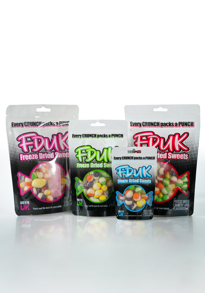
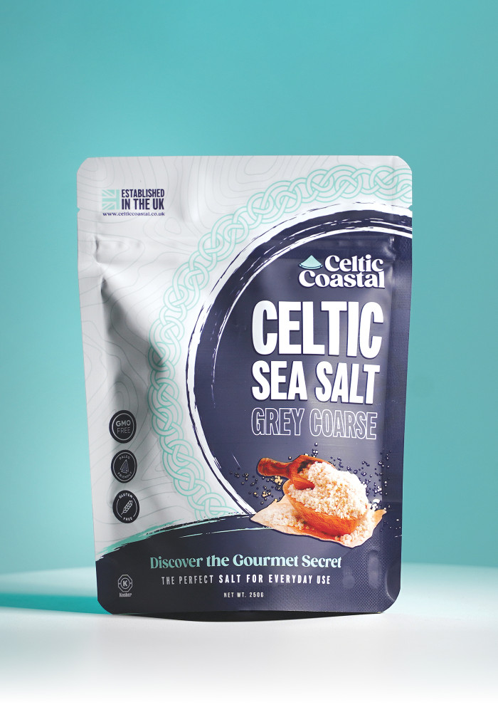
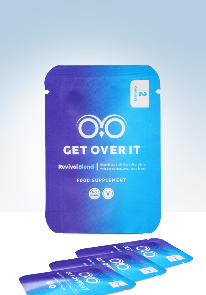
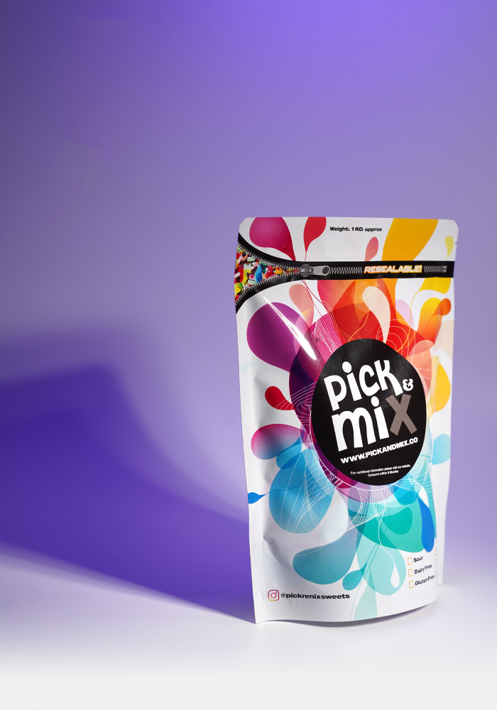
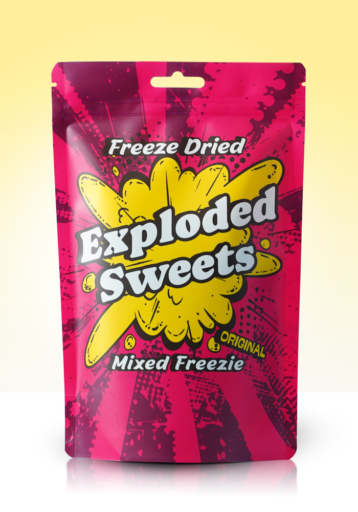
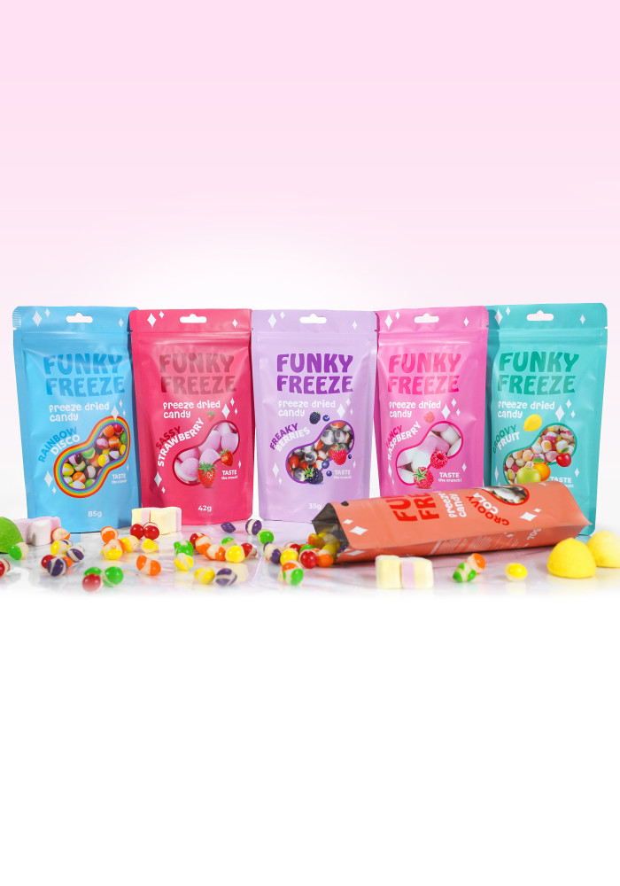
Customer Gallery Images
Custom Printing FAQs
Recyclable pouches can be recycled at home if your local authority allows for kerbside collection of soft plastics, such as Low Density Polyethylene (LDPE) of which our recyclable pouches consist of.
As an alternative, recyclable pouches can be recycled with plastic bag collection points at most supermarkets.
The MOQ varies depending on the packaging type and printing method:
- Digital printing has a low MOQ of 1,000 units
- Rotogravure printing has a high MOQ of 10,000 units
Flat bottom side gusset pouches require a MOQ of 10,000 units as these are only produced using Rotogravure.
Yes, any part of the film which forms the packaging can be printed with a design, including any gussets. Our custom printed flexible packaging is priced for fully customised packaging and isn’t limited to areas of design.
Plain film is printed with your design in its entirety prior to forming the film into a packaging product, therefore you have the scope to be as creative as you wish.
We provide a digital proof for approval and we’re able to send you a sample pack of our previous bespoke orders.
A print tolerance is whereby a certain percentage of the product produced may be either less than, or greater than the tolerance percentage noted on your quote and will be chargeable/creditable depending on the final quantity produced.
High speed printing experiences challenges when it comes to quantity specifics. You will be charged for any additional units according to the original order quantity and the tolerance percentage shown or you will be credited if the final quantity tolerance was below your original order quantity.
It’s worth noting that low order quantities are usually more costly per unit and can incur high percentage print tolerances. You might want to consider increasing your order quantity which may result in roughly the same cost but for more units!
- Request a Quote:
Visit our website to get in touch and either ‘Book a Free Consultation’ at a time to suit you to discuss your requirements or click ‘Get a Quote’ and provide us with details of your packaging project. - Receive Your Quote:
Once we’re aware of your requirements, we’ll prepare a no obligation quote which will be sent to you for review. - Approve the Quote:
After reviewing the quote, you can approve it if everything meets your needs. If adjustments are required, let us know, and we'll revise the quote accordingly. - Invoice and Payment:
Upon approval of the quote, we will issue a pro-forma invoice. The invoice will include all payment details and instructions. To proceed with the order, make the payment as outlined in the invoice terms.
- Digital printing is 100% advance payment.
- Rotogravure printing is 40% advance payment along with 100% advance payment of cylinder(s), and the 60% balance paid upon completion.
Testimonial
Really happy with Right Pak. Quality bags at great prices and customer service is brilliant. Thank you..

I wanted to take a small amount of time out to say that Rightpak set the standard for customer service. Orders always arrive on time and nothing is to..
We always order from RightPak, and they never disappoint. Their efficiency is top-notch—we consistently receive our deliveries quickly and without any..
Very high quality products and extremely high level service, I was very impressed with the customer service response from Lisha, she not only helped m..

I had a great customer service experience with Nidhi.. Helped me with my order and even helped in correcting an error I made. Nidhi is amazing . Even ..
Fantastic service! Not only sorted an issue in a quick and timely manner (not there fault, was Amazon) but also helped suggest an alternative and stil..
Can not beat the customer service with this lady who answers to their WhatsApp number. Replies more or less straight away and gets your orders done th..
Their services are exclusive, quick response and good quick delivery time. The products are also of a marvellous quality. The Kraft window bags are s..
Great service, we needed the goods really fast and they handled it right away!..
Great service from Rightpak, the guys were very helpful and made sure my order was spot on before dispatching it to me. Good quality products at a gre..
I am delighted to share my exceptional experience with RightPak, the distinguished packaging company that recently brought my brand's vision to life t..